London Trip - Brutal Barbican
I've been feeling a little uninspired recently, and so I took the coach into London this Wednesday (armed with lots of reading for the journey, of course) to see some exhibitions. I had tickets for Boom for Real, the Basquiat exhibiton at the Barbican.
The exhibition was excellent but what really caught my eye was the concrete masterpiece that is the Barbican Estate in which the exhibition was housed. Designed by architectural firm Chamberlain, Powell and Bon in the 1950s, and completed in the 1970's, it provided a much needed post-war housing development on a site devastated by bombing. Amy Frearson in Dezeen (2014) describes the estate as such:
With its coarse concrete surfaces, elevated gardens and trio of high-rise towers, the Barbican Estate offered a new vision for how high-density residential neighbourhoods could be integrated with schools, shops and restaurants, as well world-class cultural destinations.
I've had a long term obsession with Brutalist architecture - growing up in Slough I had access to such delights at the Brunel Bus Station and Slough Library, and even focussed an A Level Photography project on Brutalism, including angular shots of the Southbank Centre. I'm not sure why I love it so much, but I do - Brutalism seems to be very much a 'Marmite' subject.
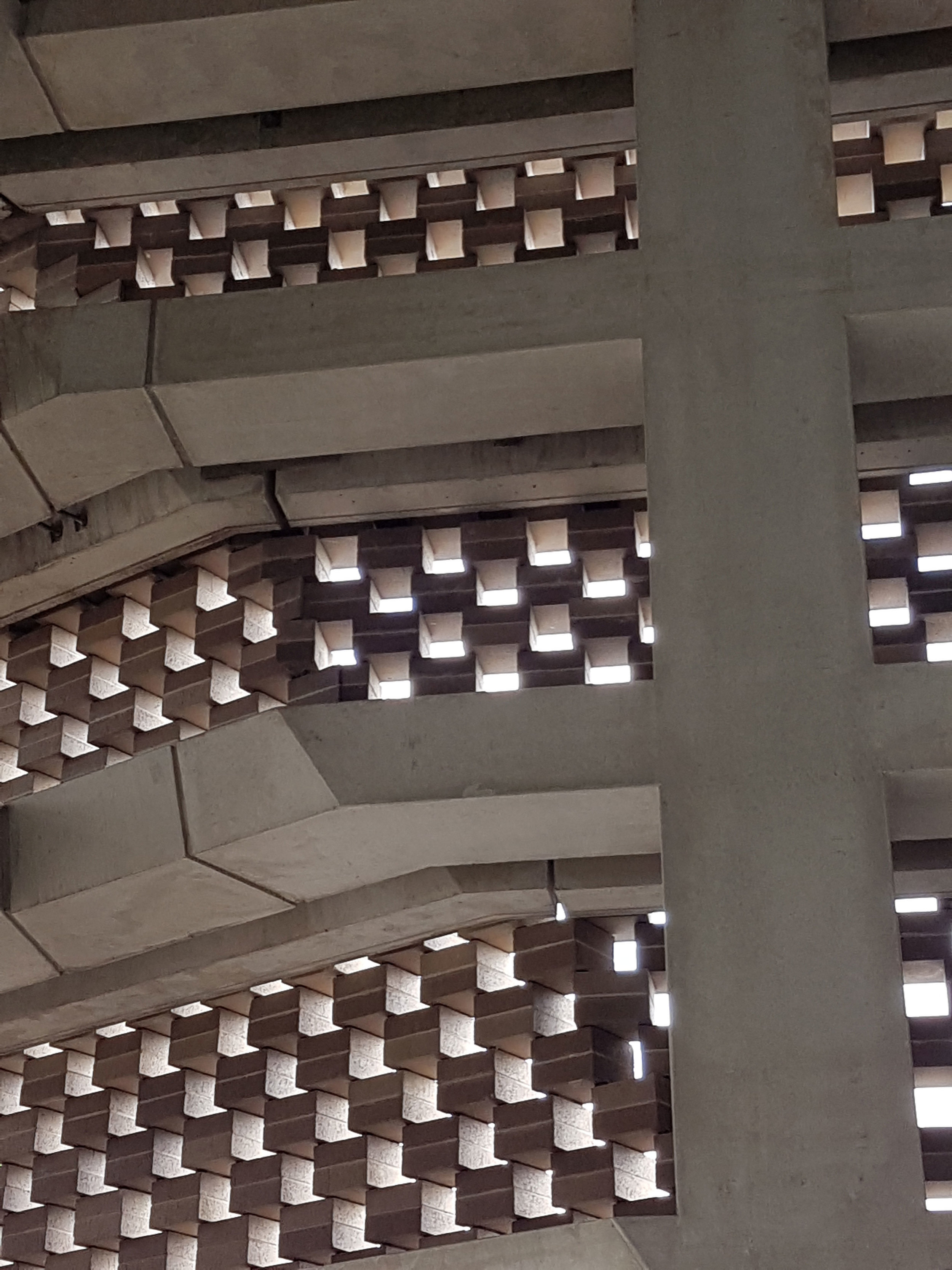
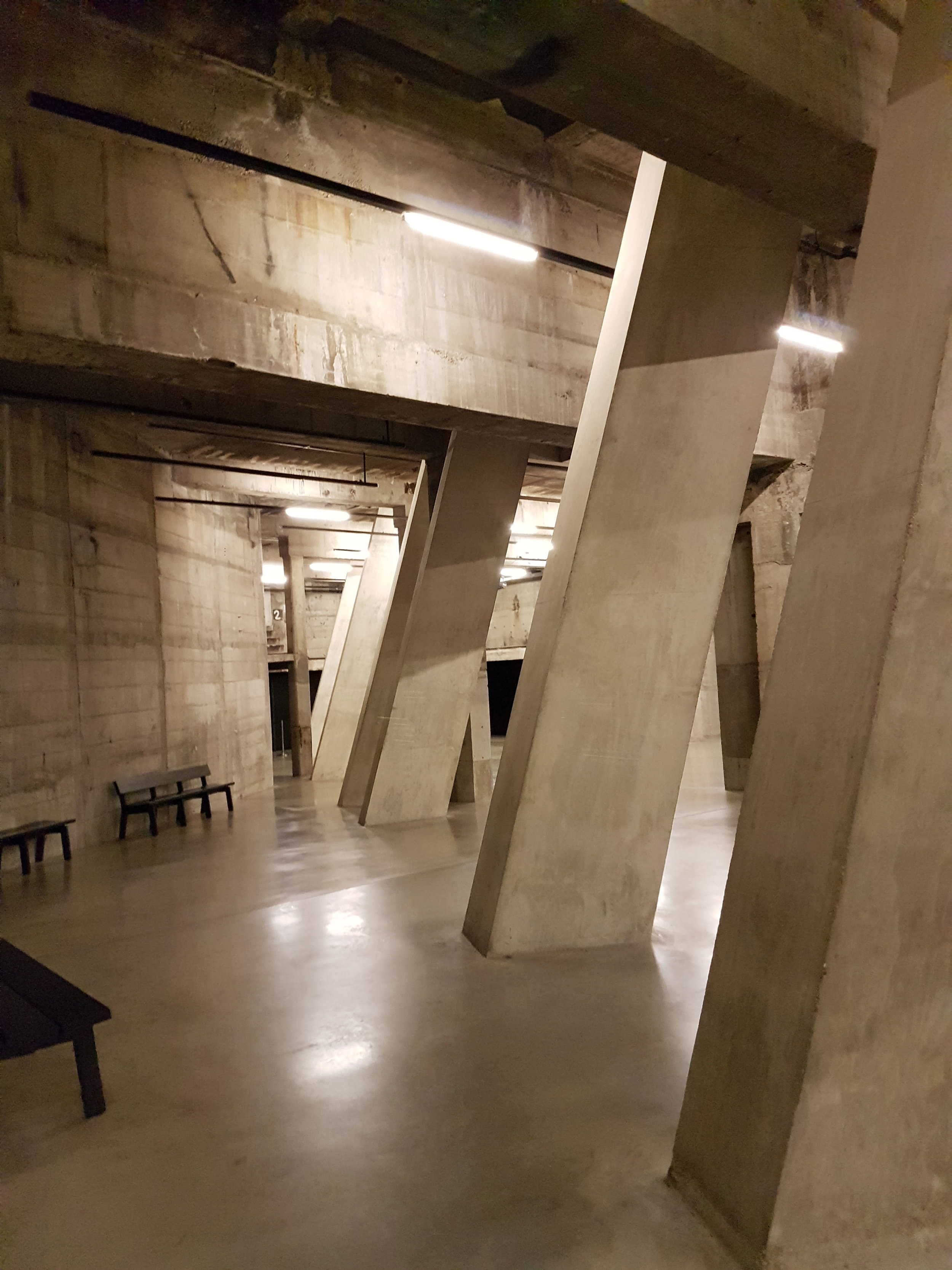
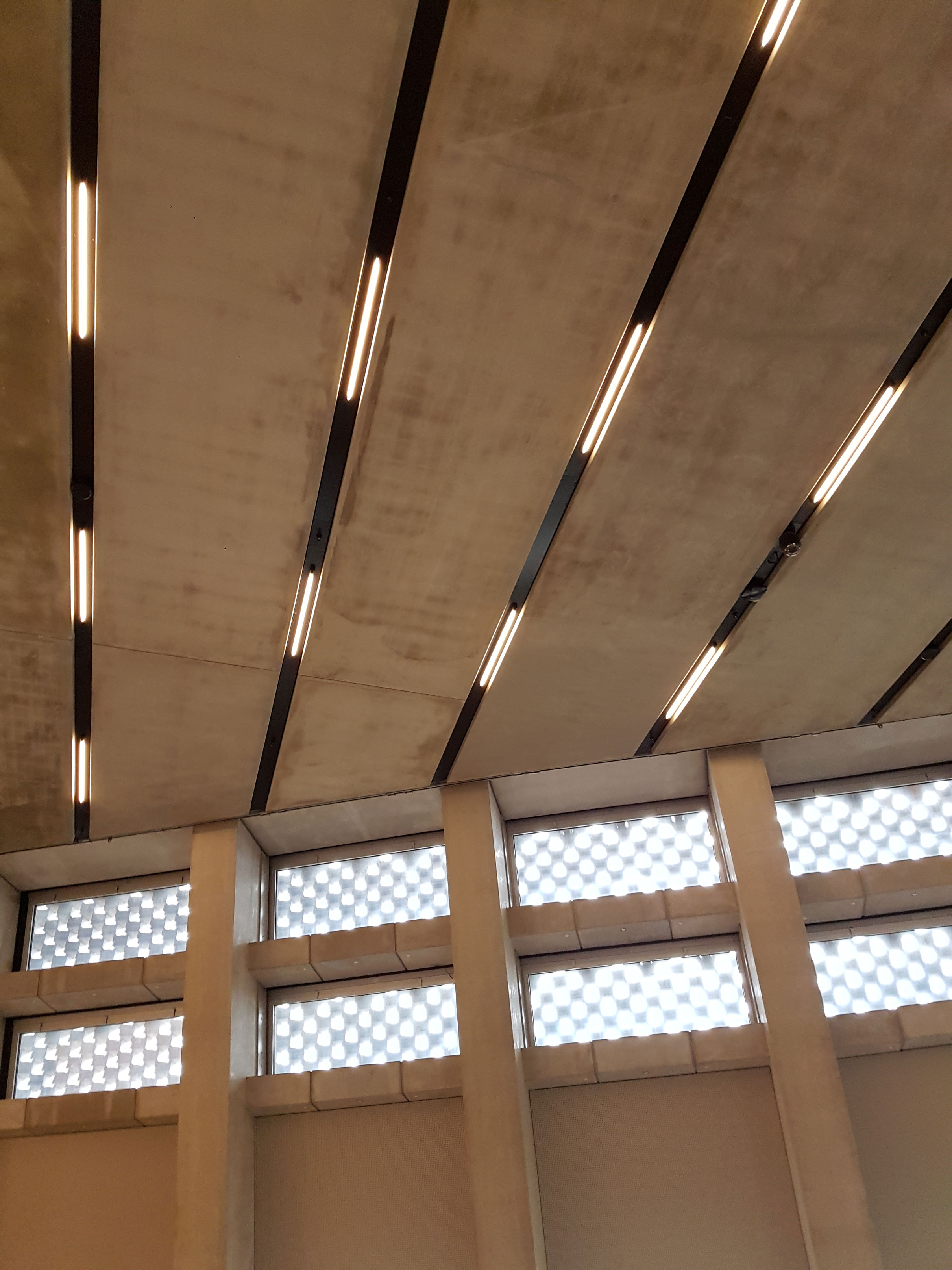
I had some time left after my time at the Barbican before my coach home, and so wandered over the River Thames to the Tate Modern, which I hadn't visited since the new Switch House was built. Although modern, it had echoes of Brutalism, and despite having an external facade of Brick, had a concrete inner.
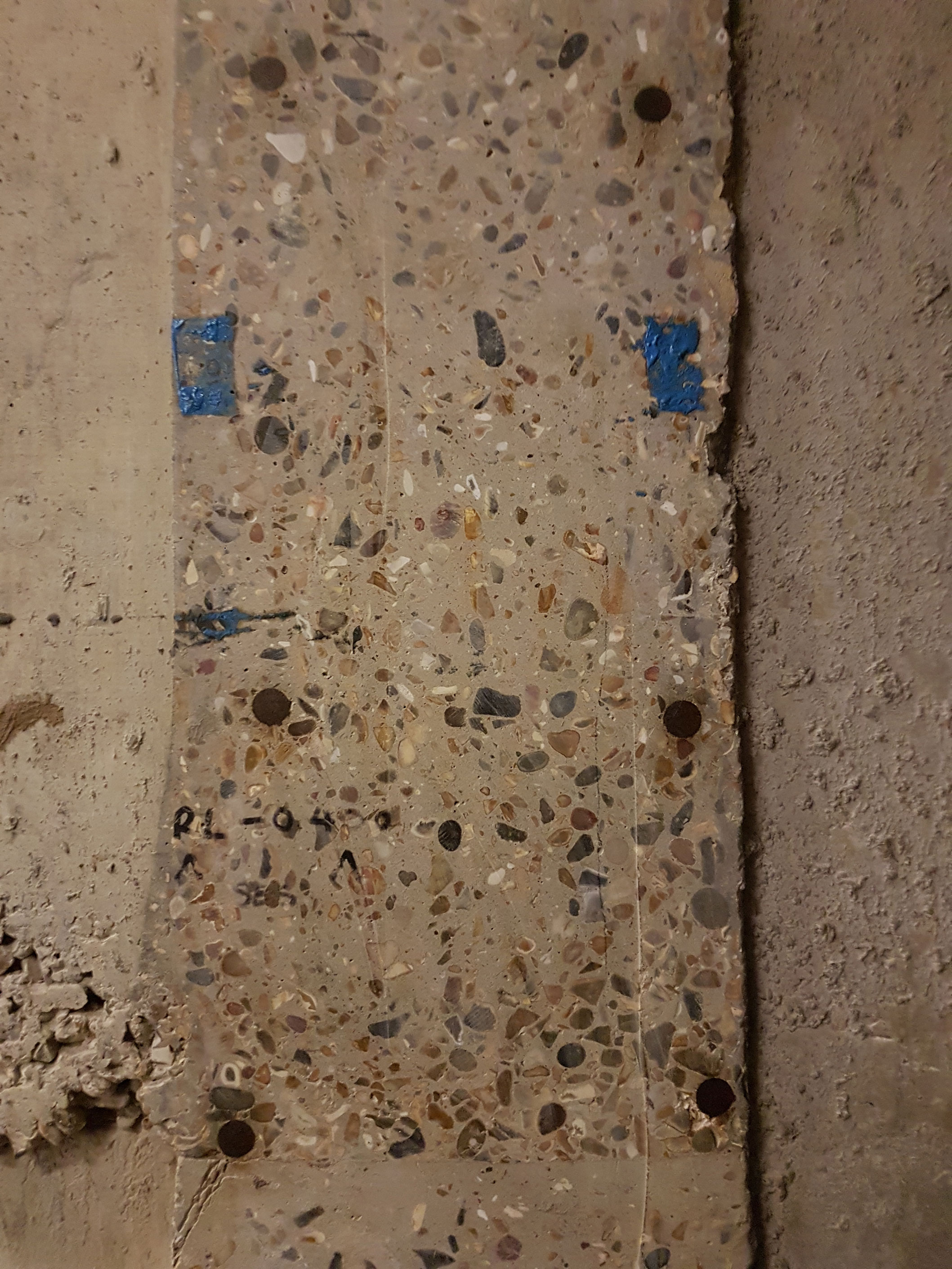
Once again, I was more impressed with the building than I was by the art inside, with my mind buzzing as to how I could incorporate these grey angles into my knitted textiles. Oliver Wainright in the Guardian even comments on it's knitterly properties:
The effect is mesmerising, looking like knitted fabric from some angles, or like a low-res digital model from others – especially where the surface judders around the oblique corners in a pleasingly awkward glitch.
From the dizzying heights of the viewing platform, to the underground tanks, this new addition to the Tate Modern is a triumph in concrete architecture.
The frantic, busy nature of the City of London combined with the stark, grey angles of these buildings, provide an excellent contrast to the rugged, remote nature of my initial source material from Islay. My thoughts are that I will use the lines and angles of Brutalist buildings to influence the form and structure of my knitted textiles, and the colours and organic forms of the Islay flora to influence the naturally dyed palette and surface embellishments.
References:
Burns, R. (2017) Barbican Estate Centre. (Own collection)
Burns, R. (2017) Tate Modern interior. (Own collection)
Frearson, A. (2014) Brutalist buildings: Barbican Estate by Chamberlin, Powell and Bon. [Online]. [Accessed 13 October 2017]. Available from: https://www.dezeen.com/2014/09/13/brutalist-buildings-barbican-estate-chamberlin-powell-bon/
Wainright, O. (2016) First look: inside the Switch House – Tate Modern's power pyramid. [Online]. [Accessed 13 October 2017]. Available from: https://www.theguardian.com/artanddesign/2016/may/23/first-look-inside-tate-moderns-power-pyramid
If you’ve enjoyed reading this blog and found it helpful, why not buy me a virtual coffee on Ko-Fi? There’s no obligation, but your support will help me continue to write these blogs and help me continue my journey to becoming a self-sufficient natural dye grower and knitwear designer. Ria :)


